Data Visualization
What it is and why it is important
Data visualization is the presentation of data in a pictorial or graphical format. For centuries, people have depended on visual representations such as charts and maps to understand information more easily and quickly.
As more and more data is collected and analyzed, decision makers at all levels welcome data visualization software that enables them to see analytical results presented visually, find relevance among the millions of variables, communicate concepts and hypotheses to others, and even predict the future.
Because of the way the human brain processes information, it is faster for people to grasp the meaning of many data points when they are displayed in charts and graphs rather than poring over piles of spreadsheets or reading pages and pages of reports.
Interactive visualization
Interactive data visualization goes a step further – moving beyond the display of static graphics and spreadsheets to using computers and mobile devices to drill down into charts and graphs for more details, and interactively (and immediately) changing what data you see and how it is processed.
Why is data visualization important?
Visualizations help people see things that were not obvious to them before. Even when data volumes are very large, patterns can be spotted quickly and easily. Visualizations convey information in a universal manner and make it simple to share ideas with others. It lets people ask others, “Do you see what I see?” And it can even answer questions like “What would happen if we made an adjustment to that area?”
Consider the manufacturing director of product reliability for an international company that produces small vibrating cell phone motors. One of the director’s principal responsibilities is to determine how reliable the cell phone motors will be with each year of age. If the product’s reliability falls short of the standards set forth by the cell phone manufacturers who use the motors, his company could lose major contracts.
Spreadsheets are hard to visualize
Because of the amount of data collected on the age and reliability of the cell phone motors, a traditional electronic spreadsheet cannot visually represent the information due to data presentation limitations. And, if printed out, the spreadsheets would be a humongous pile of paper on the director’s desk. In both cases, the director would spend hours searching among thousands of rows and columns of data with still no concrete answer to the original question about the relationship between the motor’s age and its reliability.
Data visualization makes interpretation easier
Data visualization presents the data in a way that the director can easily interpret, saving time and energy. For example, the graph above shows the number of units that correspond to each age (represented by the color gradient) as well as the reliability as the age of a unit increases. In a matter of seconds, the director can see that units approaching 10 years of age are approximately 40 percent reliable. This visual simplifies the data, instantly clarifying the factors affecting the reliability of the cell phone motors.
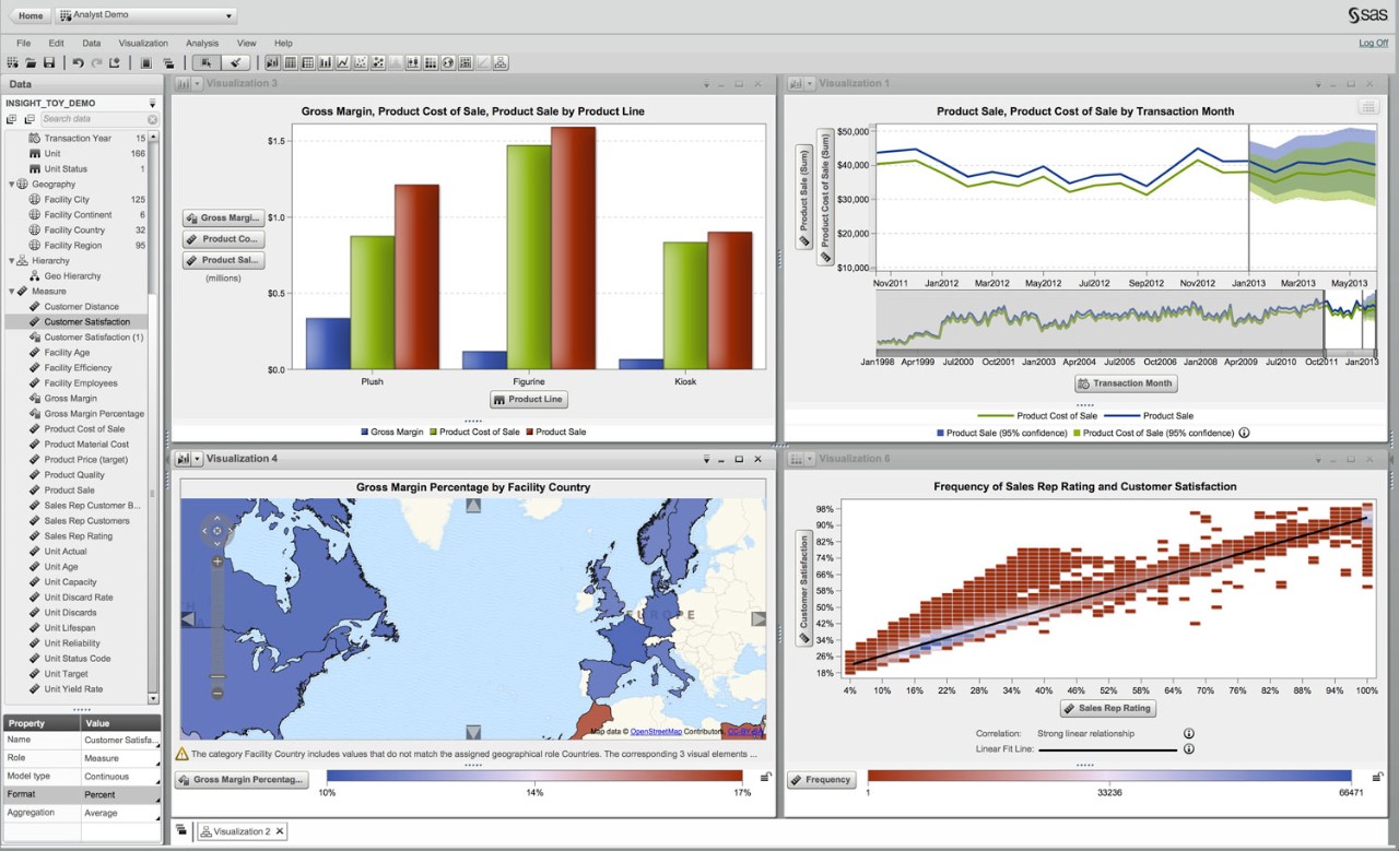
Interactive charts and graphs like the ones shown above make it easier for decision makers across all organizations to:
- Identify areas that need attention or improvement.
- Understand what factors influence your customers’ behavior.
- Know which products to place where.
- Predict sales volumes.
- Discover how to increase revenues or reduce expenses.